
Art Deco Typefaces: Period Lettering and Modern Revivals
Learn the traits of Art Deco typefaces, compare five documented period designs, and distinguish original lettering from revivals and Deco-style fonts.
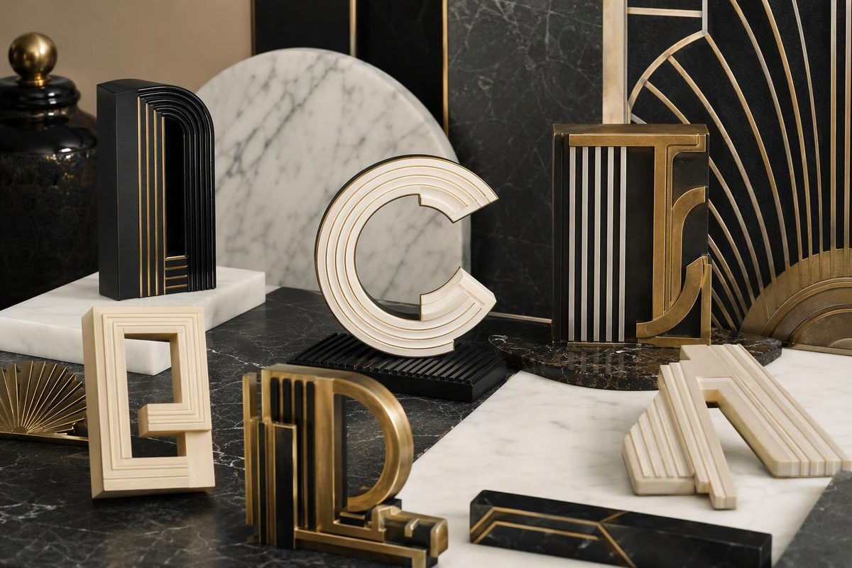
Art Deco typefaces are not a single family of fonts. They include documented interwar type designs, one-off poster and architectural lettering, later revivals, and modern fonts that borrow Deco geometry. You can recognize recurring traits, but typography alone cannot authenticate or date an object.
Choose the evidence you have; the checker will identify the most defensible classification.
Your Evidence Result
Undetermined
Select all three evidence fields. A visual resemblance alone cannot establish a period typeface or date an object.
This is an evidence classification, not an authentication. Paper, printing, provenance and building or manufacturer records remain necessary.
Period Reference Points
| Face | First Issue | Useful Check |
|---|---|---|
| Broadway | 1927 | Lowercase followed in 1929 |
| Bifur | 1929 | Masses, gaps and linear infill |
| Indépendant | 1930 | Broad, compact forms |
| Huxley Vertical | 1935 | Extremely narrow display forms |
| Peignot | 1937 | Capital-like lowercase forms |
Sources: the dated museum, foundry and Letterform Archive records cited in the accompanying article. “—” would indicate unavailable evidence; none of these issue years is estimated.
Bifur Shows Why “Art Deco Typeface” Is Complicated
In 1929, A. M. Cassandre reduced letters to solid masses, fine lines and carefully placed gaps. His Bifur specimen did not merely spell words; it made each word behave like a poster. The V&A catalogues a brochure spread promoting the typeface, designed by Cassandre for Deberny & Peignot in Paris, in which thin black lines occupy blank areas within the letters (V&A).
Bifur is unmistakably of its moment, but Art Deco typography was never one alphabet. It included foundry type, hand-drawn poster lettering, architectural inscriptions and streamlined commercial scripts. Today, the label also covers digital revivals and new fonts that borrow only a few period mannerisms.
Art Deco Typefaces Share Traits, Not a Single Formula
Art Deco type often combines several characteristics:
- Geometric construction: Circles, semicircles, straight strokes and sharp diagonals.
- Extreme proportions: Very narrow capitals, broad display letters or unusually tall forms.
- Shifted crossbars: The horizontal stroke of an A, E or H may sit conspicuously high or low.
- Strong stroke contrast: Thick structural strokes meet hairlines, open gaps or striped sections.
- Simplification: Curves and terminals are reduced to crisp, machine-like shapes.
- Display emphasis: Capitals, numerals and short words receive more attention than comfortable long-text reading.
- Architectural rhythm: Repeated verticals, stepped contours and symmetrical spacing make a word resemble a façade or marquee.
These are tendencies rather than a certification test. Letterform Archive identifies geometry, elongated forms, exaggerated waistlines and contrasting strokes as recurring features. It also notes that foundries of the 1920s and 1930s used contemporary terms such as “modernistic,” “moderne” and “streamline,” rather than consistently calling their work Art Deco (Letterform Archive).
The New York Public Library dates the broader international style to 1919–1939 and says it received its current name in 1968 (NYPL). A 1930 catalogue will not necessarily describe its display faces as “Art Deco,” while a font sold under that label today may be entirely modern.
Five Documented Period Typefaces
| Typeface | Period Record | Diagnostic Features |
|---|---|---|
| Broadway | Morris Fuller Benton designed the original for American Type Founders in 1927. Sol Hess added lowercase in 1929 and drew Broadway Engraved in 1928 for Lanston Monotype. | High contrast, geometric bowls and emphatic vertical strokes. The chronology matters when assessing lowercase text. (P22/Lanston Type Company) |
| Bifur | Cassandre designed it for Deberny & Peignot in 1929. Surviving period specimens are catalogued by the V&A. | Monumental capitals assembled from solid masses, open interruptions and linear infill. Similarity alone does not establish that an alphabet is Bifur. (V&A) |
| Indépendant | Jos Dufour and Joan Collette designed it in 1930 for the Belgian foundry Etablissements Plantin. | Broad, compact and chunky forms—a counterexample to the idea that Deco lettering must always be thin and elegant. (Letterform Archive) |
| Huxley Vertical | Walter Huxley designed this 1935 face for American Type Founders. | Extremely narrow, upright display forms that gave printing a streamlined Deco character. |
| Peignot | Cassandre developed it for Deberny & Peignot. It appeared in 1937 and was used in signage and printed material for that year’s Paris exhibition. | An experimental lowercase retaining several capital-like forms while preserving ascenders and descenders. Printers found the capitals more practical than the full text face. (Production Type) |
These five faces are documented reference points, not a complete canon. Foundries issued many regional “moderne” faces, while sign painters and poster artists devised alphabets for individual commissions.
Typeface and Lettering Provide Different Evidence
A typeface is a repeatable system of characters intended for setting multiple texts. Lettering is drawn or constructed for a particular word, sign or composition. A poster can therefore contain exemplary Art Deco typography without using a named typeface.
Cassandre’s Nord Express makes the distinction visible. The 1927 lithograph integrates its title, destinations, border and rushing train into one composition. The V&A places the poster within Art Deco while also noting its debt to Cubism and the modernity of its railway subject (V&A). The museum does not identify its title lettering as Bifur, which was not issued until 1929.
That chronology warns against identifying every angular Cassandre letter as one of his typefaces. A designer’s custom lettering and type designs may share a visual language without being the same alphabet.
Repetition can help distinguish the two. In set type, repeated letters should normally share the same underlying form, allowing for printing wear and inking. Hand lettering may alter two instances of the same letter to balance a composition.
Architectural letters introduce another category. They may derive from drawings but be individually cut, cast or fabricated for one building. Their consistency does not necessarily prove that they came from a commercially issued typeface.
Date the Object Before Naming Its Typeface
Begin with the printer, publisher, building records, product model, paper, printing process and provenance. Typography can support that evidence; it rarely replaces it. A typeface designed in 1927 could appear on an object from 1937, 1977 or yesterday.
For printed material, search period foundry specimens rather than relying on a modern font seller’s preview. American Type Founders’ surviving 1934 specimen book is a dated primary reference for faces the company then offered (Internet Archive). Compare the relevant specimen with the object, including its variant name and available character set.
A specimen match establishes more than a resemblance to the general style, but it still does not date the physical object by itself. Later printers could use older type, and modern designers can reproduce historical letterforms digitally.
Diagnostic Characters Are More Useful Than a Familiar A
Compare several letters and numerals rather than stopping at a similar-looking capital A. Particularly useful forms include:
- the leg and bowl of R
- the spur or crossbar of G
- the middle strokes of M and W
- the curve and terminals of S
- the tail of Q
- the shapes of 2, 3, 4 and &
Also compare proportions, stroke contrast and spacing. A modern revival may preserve the period capitals while redrawing punctuation, accents or lowercase characters. A loose similarity in one conspicuous letter is weaker evidence than agreement across a varied character set.
Character-Set Chronology Can Expose a Misidentification
Broadway demonstrates why the date of a particular character matters. Its original American Type Founders design dates to 1927, but the lowercase followed in 1929. An object supposedly printed in 1927 with Broadway lowercase needs stronger evidence than visual resemblance.
The text might use custom lettering or another face, or the object might be a later reproduction. The presence of a familiar name does not resolve that conflict; the claimed version and character set must have existed at the relevant date.
This principle also applies to later revivals. Digitizations commonly add characters, language support, weights or punctuation that were absent from the original issue. Those additions can be useful in modern design without being evidence of an interwar source.
Period, Revival and Deco-Style Are Separate Claims
These descriptions answer different questions:
- Period typeface: A typeface designed and issued during the historical Art Deco era.
- Later revival: A subsequent adaptation of a documented older face, potentially with redrawn or expanded characters.
- Deco-style typeface: A later design that borrows the era’s visual vocabulary without reproducing one period face.
- Period lettering: Original lettering made for an interwar object, poster or building, whether or not it became a typeface.
A digital font file is not itself an interwar artifact. Even an authorized digitization is a modern implementation of an older design. Conversely, period typography need not match a named face: it may have been drawn, painted, engraved or fabricated for that commission.
For collectors, “Art Deco font” is therefore too imprecise to support authentication. The description may refer to documented period type, custom lettering, a later revival or merely a contemporary mood. Establish which claim is being made, then test it against dated specimens and the physical object.
Use Deco Type as Display, Not Costume
For a historically informed modern design, choose the typographic role before choosing the decoration. Bifur and Broadway are emphatic display faces; they are better reference points for a title, monogram or short sign than for paragraphs. Peignot’s experimental lowercase shows why visual novelty and continuous readability are different requirements.
Use one or two period signals—perhaps compressed capitals and a high crossbar—rather than combining every cliché. Pair a decorative display face with a restrained text face, and let spacing and composition carry part of the character.
The same principle applies across Art Deco’s defining design elements: geometry alone does not establish the style, and surface resemblance does not establish date. A typeface name can identify a design source, but it cannot authenticate the object carrying it.