
Art Deco Interior Colors: Period Palettes and Modern Choices
Explore documented Art Deco colors, from pale wood and silver to blue-green patterns, with practical palettes and checks for historic interiors.
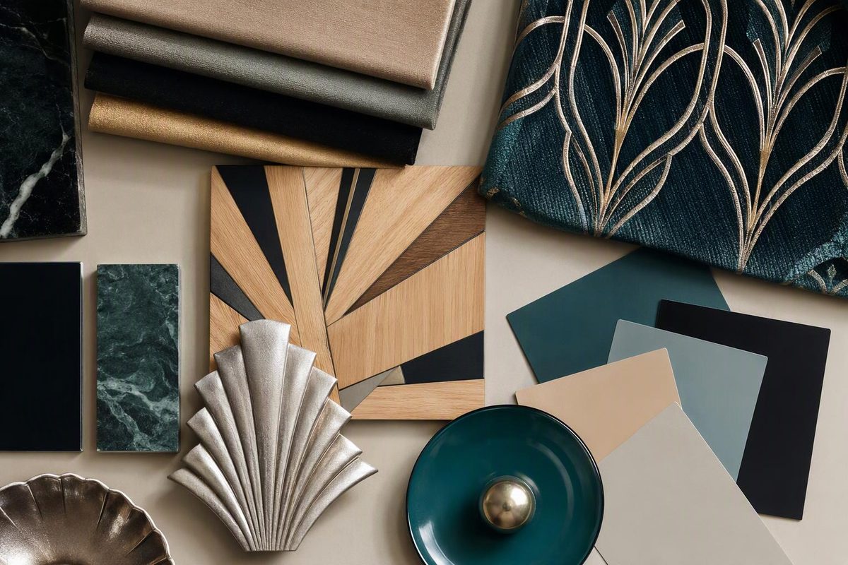
At Eltham Palace, Peter Malacrida designed a dining room whose effect depends on bird’s-eye maple, an aluminium-leaf ceiling and black-and-silver doors—not a black-and-gold scheme. The house was built in 1933–36 for Stephen and Virginia Courtauld, and its interiors show how much variety could exist within one fashionable home. English Heritage’s description records both the materials and the designers.
Art Deco interior colors are best understood as combinations of hue, material and finish. Black, pale neutrals, gold and silver offer useful starting points, but documented period designs also include blue-green patterns and warm wood tones. There is no single palette that makes a room authentically Art Deco.
What the period evidence shows
Pale colors, wood and silver
English Heritage identifies pale paint colors and walls lined with native and exotic woods as features of the Courtaulds’ interiors. Malacrida’s dining room sets the figured maple against a reflective ceiling and sharply contrasting doors. Its richness comes from the surfaces themselves rather than from deeply colored walls. Eltham Palace is therefore a useful corrective to the idea that Deco rooms must be dark. The house’s present display mixes original and replica furnishings; the dining table and chairs are replicas made in 1998 of Malacrida’s originals.
For a present-day room, this suggests a restrained combination: warm ivory walls, pale wood, black outlines and silver-toned accents. That is a design adaptation, not a reconstruction of Malacrida’s scheme.
Gold as a surface, not merely a paint color
Jean Dunand’s Sunrise/Sunset screen, about 1930, has a monochromatic gold surface. The Metropolitan Museum describes its metallic finish as luxurious rather than functional, with the warmth of the gold suited to the solar imagery. Its materials are lacquered wood and gold. The museum record demonstrates that a Deco object could be restrained in color yet sumptuous in finish.
Eltham offers another approach: Virginia Courtauld’s bathroom combines gold mosaic, onyx and gold-plated taps. Here, stone and metal supply the palette. English Heritage documents those finishes.
The practical distinction matters. Flat mustard paint, metallic gold paint and gold leaf may share a color name, but they do not create the same effect.
Blue and green in patterned decoration
Émile-Allain Séguy’s Prismes pattern book provides a documented alternative to neutral-and-metallic schemes. Plate 10, dated about 1930 by the Met, combines fragments of circles in different greens with semi-abstract fireflies over stripes in two blues. The museum identifies the book as containing Art Deco designs, probably intended for textiles. Séguy’s plate supports blue and green as a period design combination—but not as evidence that any particular room had blue-green walls.
For decorating, a patterned textile can carry this complexity while the surrounding surfaces remain quieter. For the forms themselves, see our guide to Art Deco geometric patterns.
Four usable Art Deco-inspired palettes
These are modern decorating proposals drawn from the examples above, not original paint specifications.
| Palette | Main surfaces | Contrast and accents | How to use it |
|---|---|---|---|
| Ivory, black and gold | Warm ivory walls; wood furniture | Black frames or edging; selected gold-toned details | Keep gold concentrated in a lamp, mirror or decorative object rather than every fitting. |
| Pale wood, silver and black | Pale neutral walls; figured wood | Silver-toned lighting; black upholstery or outlines | Let the wood grain and reflective metal provide the interest. |
| Blue, green and cream | Cream walls; blue-green curtains, rug or upholstery | A few dark outlines | Give the pattern one clear focal area instead of repeating it on every surface. |
| Stone, gold and warm white | Warm white walls; stone-colored surfaces | Gold-toned metal; an onyx or other stone object | Use variations in texture and reflection to enrich a limited palette. |
If you prefer emerald, navy or burgundy, treat them as choices for a contemporary Deco-inspired room—not as compulsory period colors. A single saturated upholstery color against lighter walls can be easier to balance than several competing jewel tones.
Start with the largest fixed surface: the floor, stonework or an important piece of veneered furniture. Choose the wall color around it, then add one strong contrast and a limited accent. Compare physical samples beside the actual wood and metal, in daylight and under the room’s evening lighting. A screen image cannot specify how those materials will look together.
Are Miami pastels original Art Deco colors?
They belong to the story, but not in the simple way decorating summaries often imply.
Architectural conservator Tania Alam’s National Park Service article explains that Miami Beach’s historic buildings were mostly white with small touches of jade green, ochre or coral. Leonard Horowitz’s much broader pastel palette was created in the late 1970s as part of the preservation revival, using colors inspired by the sun, sky, sand and ocean.
That account concerns building exteriors, not a universal interior palette. Aqua, shell pink and seafoam green can make an appealing South Beach-inspired room, but such a scheme should not automatically be described as a faithful 1930s restoration.
When color needs proof
For an existing historic interior, choose the target date before choosing the paint. An original scheme, a significant later alteration and a new Deco-inspired treatment are different things.
The National Park Service’s guidance on historic interiors treats paints, wall coverings and decorative finishes as potentially character-defining elements. It recommends assessing the building’s history, surviving features and alterations before rehabilitation. Preserve evidence rather than stripping finishes simply to expose an assumed “original” color.
Ask what supports the proposed scheme: dated specifications, invoices, documented color illustrations or professional examination of surviving finish layers. A monochrome photograph may show placement and light-dark contrast, but it cannot settle the hue. Likewise, green upholstery or black lacquer does not date a piece of furniture. Our guide to period Art Deco sofas explains the construction and documentary checks needed beyond appearance.
For a new room, a well-balanced palette is enough. For a restoration or a claim of period authenticity, the color needs evidence tied to that particular room or object.